
Meet the artist: Tom Frost
Author: Emily Miles
Tom Frost is the artist and printmaker behind our new Good Ordinary Claret limited-edition label. Here we speak to him about his work, his inspiration and why embracing the handmade is a philosophy he lives by
Artist Tom Frost sits against the whitewashed walls of his studio in West Wales; a space which he has lovingly renovated. The building embodies his philosophy as an artist: it’s handmade, and it’s filled with simple, everyday things which he has made beautiful through care. It’s a place to think and to create. Tom works here alongside Teresa, his partner and fellow artist, and – on occasion – with their two young children, Harry and Poppy.
You may well already be familiar with Tom’s art. His stylish, graphic screen-prints are to be found on oversized matchboxes and artisan gin bottles. Elsewhere, his delicate, detailed illustrations bring to life rainbows and refraction in the pages of his Ladybird children’s book, The Weather. And, at the more erudite end of the spectrum, his works adorn the walls of galleries and art shows. Back in 2014, he held a solo exhibition, The Wild Collection, at the world-class Yorkshire Sculpture Park. He assembled more than 50 pieces inspired by the UK’s native birds, plants and wildlife for the show.
Going back to nature
Nature is a recurring theme for Tom – one which runs throughout his craft. It’s what pulled him out here, to this remote spot in West Wales; and it’s what pushed him from the creative bustle of life in Bristol almost a decade ago. “Nobody needs to come out here; no roads lead here,” Tom says. “We’re surrounded by fields and farmland, but we’re not somewhere you’d classically call a beauty spot. But walk out from the door, and you’re right in it – amongst sheep and cows, red kites and woodpeckers. There’s an immediate connection.”
And there’s plenty more inspiration to be found on his doorstep. “There’s so much to draw from,” says Tom. “Architecture, folk art, my children, our house, being in cities, being away from them. I take lots of photographs and I have a good memory for recalling things I think will be interesting for work.”
Working with Berry Bros. & Rudd
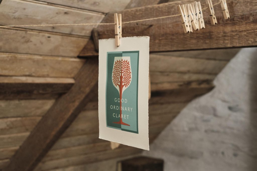
What, then, attracted him to the idea of collaborating with Berry Bros. & Rudd? “I get approached for all sorts of commissions,” Tom says. “They’re not all a good fit; but working with the oldest wine merchant in the country, for The Queen’s Green Canopy? It was impossible to say no.” Tom’s artwork, created to celebrate Her Majesty the Queen’s Platinum Jubilee, is for a charity bottling of Good Ordinary Claret. We will give a percentage of profits to the “plant a tree for the Jubilee” campaign or, as it’s more properly known, The Queen’s Green Canopy. But it wasn’t just the charity aspect, or working with Berry Bros. & Rudd, that appealed to Tom. He is interested in the idea of the bottle label itself: art in the everyday. Making useful things beautiful
“When I work as an illustrator and have an image in – say – The Guardian, somebody would see it for a day or two. And then it would be in the bin. But, with a wine label, there’s a chance that my art will play a part in someone’s home; that it will be at the centre of this lovely convivial atmosphere, where they’re enjoying their wine. I like that side of it.
“I also liked the fact that I could create a physical screen-print for this project, not just a digital image; something I could make and photograph. People might see it as just an image on a wine label. But I know it’s handmade.”
Finding inspiration
There was only one possible route for the design: “Naturally, it had to have a tree on it. And I liked the idea of combining growth and the trunk of the tree coming through the stem of the glass and essentially filling up the glass.”
To the uninitiated, screen-printed artworks – with their bold shapes and layers of colour – look simple to create. But the reality is that this process is a labour of love (and a time-consuming one at that). “It is the same with every print,” Tom explains. “I work it up as a sketch, then break it apart into different layers for each colour, then expose the screen and finally print it. It’s lovely and simple when you know how it works, but there are a lot of processes that get to a point where ink goes on paper.”
Though the technique involves plenty of skill, it doesn’t call for elaborate equipment. Tom’s studio set up – rather charmingly – comprises a £30 light bulb, a glass screen, a couple of dining chairs and a Welsh blanket. He likes the shadows and texture that can come from this rustic arrangement, rather than the precision results of a smart London editioning house.
“I’m not striving for perfection in my art,” he says. “I like to embrace the handmade, the qualities you get from not having perfect kit. The art of imperfection.”
Our limited-edition Claret by Tom Frost is available now.