Honouring the past, inspiring the present
Author: Guest Blogger
The redesign of the Berry Bros. & Rudd Own Selection wines has been more than a two-year project. The range consists of well over 60 individual wines as well as Madeiras, Ports and Sherries, and – of course – the much-loved Good Ordinary Claret.
With Berry Bros. & Rudd’s extraordinary heritage, the central tenet in the design is authenticity. Whilst creating an overall visual approach, that has a consistent set of design principles unique to Berry Bros. & Rudd, each wine required an individual nuance, resonant with its own provenance.
All the labels are essentially black and white with gold royal warrants, and are largely typographic in design. The brand logotype sits at the bottom of each label, so underpinning each design and wine type.
When I began my early research, in 2013, into the essence of the Berry Bros. & Rudd story, I discovered – after many days of photography in the rooms and cellars of No.3 and also the warehouse in Basingstoke – that the heart of the story, the visual manifestation of the brand, was typographic. Hundreds and hundreds of labels stretching back into history, many designed beautifully by hand, were of Berry Bros. & Rudd’s own making: I realised then that we had to honour this tradition and craft.
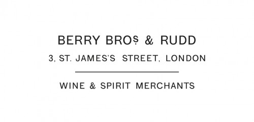
The new Berry Bros. & Rudd logotype is actually taken from an old own-brand wine label. All my inspiration for the identity has come from the brand itself, and the own-label wines are the fulfilment of this idea.
Structurally, each label design is the same, but within the overall framework there are typographic details in the wine name and descriptive text that are particular to each. The real pleasure in each label has been delving into the detail of each tiny piece of typography; finding subtle and often delicate forms that are tuned into the vernacular of each wine type. This is the approach for the core, Regional Reserve wines.
For the more individualistic Producer Partnership wines, graphic design has almost been removed. The labels are pared back, with simply the Berry Bros. & Rudd logotype, and all other information handwritten by the winemaker themselves, indicative of an authentic relationship – the intimacy of the maker and the curator. The inspiration for this once again came from the history uncovered in the cellars.
For the Madeiras, as tradition dictates, the typography is bolder and on a black background with stencilled lettering often applied; the name of each liquid taken from the boats that brought the wines to these shores 200 years ago. The Sherries are far more delicate in design, with occasional tiny pieces of ornamentation added, along with the typography, which we discovered in very old typographic volumes. The Ports probably have the most individual character: label by label, they switch from black to white backgrounds and here only did we add a touch of red.
The most sensitive part of the project was the updating and refining of the Good Ordinary Claret and Extra Ordinary Claret. The new logotype replaced the old, the original St James’s Street illustration remains and the titling was simply brought in line, sourced from the same authentic font as the brand itself: sometimes all that is required is a gentle update of a much-loved design.
The project continues to expand, and we are working on new labels every few weeks, hunting for fresh typographic inspiration, building on Berry Bros. & Rudd’s extraordinary history and dedication to its craft.


