
Designing the times: behind the Berry Bros. & Rudd brand
Author: Emily Miles
Working with Berry Bros. & Rudd was archaeological. I spent days hunting, digging and photographing in the archives trying to work out narratives and stories, and laying all the evidence out. I found countless small things that built into a story. A lot of it was about removing things which were in the way, and were clouding the picture.
There’s this incredible visual tapestry of typography and design that runs right the way through Berry Bros. & Rudd, from the outside of the building right down to the minutiae of a wine label. I tried to find something that was timeless; to build something that acknowledged the history and the heritage but without tying it to a specific moment.
Take the new logo: it has a sense of age to it – but you couldn’t say it was Victorian or Sixties: it is ambiguous, and purposely so. I found it in the archives and had it re-drawn: there is idiosyncratic spacing, a mad little comma you’d never deliberately put in now, and an odd old typeface that you could never get today – but it’s a neat summation of the spirit of what we’re doing.
![]()
We haven’t made the fonts or designs old and stuffy; we haven’t used traditional typefaces – Chronicle and Grot are modern interpretations which bring a subtle but essential difference. I hope people can feel the difference. The typefaces we now use are unique and protected.
You could quite easily be frightened by the sheer age and weight of responsibility working with a brand with such history and heritage. You need to do justice to it and be respectful but not be too weighed down by the wealth of knowledge. I had to be ruthless and try not to be seduced by it. Because, of course, the wine world is a very seductive thing – after a six-week wine course, I was dizzy with pleasure; it was such a romantic and poetic thing: that notion that when you take a sip of wine you are tasting a moment in time – whether six or 60 years ago. And then of course, the wine forms a moment in your history too – where, from the present, the taste and smell can transport you to another time…
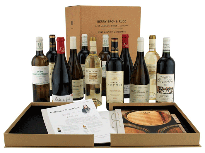
With such a wealthy narrative there is no need to embellish the truth. Take the photography we’re using for Wine Club: there’s nothing polished about it. Shot in the field, capturing the behind-the-scenes of the making and growing and bottling of wine. It’s the true story of the rough and tumble of the wine world and it pulls the viewer into that intimacy which exists between Berry Bros. & Rudd and the producer. The equation between maker and curator has a real beauty to it.
Great design is intuitive. Knowledge is nothing without intuition. It’s not about self-conscious cleverness. It’s about being wise and giving design space to breathe.
Click here for more on Harry and his recent work at Pentagram. For further information about our Wine Club go to the Wine Club pages.